A better transformation than my better transformation
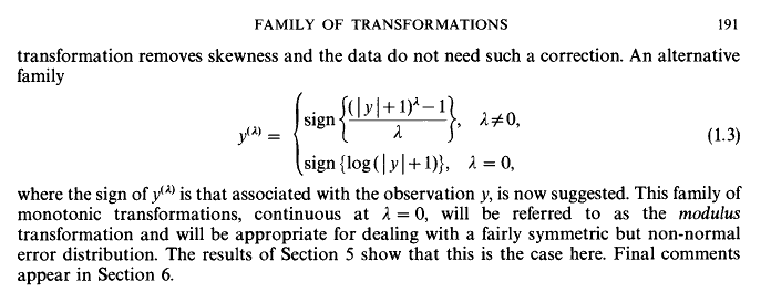
In an earlier post I put forward the idea of a modulus power transform - basically the square root (or other similar power transformation) of the absolute value of a variable like income, followed by restoring the sign to it. The idea is to avoid throwing away values of zero or less, which happens with the logarithm transform that is most commonly used for this sort of data. In a tweet, Hadley Wickham pointed out the 1980 article in the Journal of the Royal Statistical Society An Alternative Family of Transformations by J. A. John and N. R. Draper (behind the paywall but a guest logon is available) in which they proposed a very similar idea:
I hope I’m not breaching copyright by posting that snippet; I’ll certainly take it down if anyone complains. I agree with Wickham that this useful piece of work should be much more widely known (and am sheepish myself for not knowing it) so hats off to the JSTOR for having it available at all.
John and Draper also show that the methods Box and Cox use to determine parameters of the boxcox transformation can be used to get an optimal value of their tuning parameter lambda. I’m not too worried about that just yet as I’m only using this for visualising the distribution; it might be something I want to investigate though when I move to modelling the data.
Implementing a transformation for easy re-use
John and Draper’s transformation is slightly different from mine, has some nice properties and is definitely much more thoroughly thought through. It’s more complex though, and deserves a proper defined implementation for re-use. There’s no better way of doing this than creating a new transformation using the platform provided by Wickham’s scales package, very appropriate given where tip came from. Here’s how I try that:
library(scales)

# John and Draper's modulus transformation
modulus_trans <- function(lambda){
   trans_new("modulus",
             transform = function(y){
                if(lambda != 0){
                   yt <- sign(y) * (((abs(y) + 1) ^ lambda - 1) / lambda)
                } else {
                   yt = sign(y) * (log(abs(y) + 1))
                }
                return(yt)
             },
             inverse = function(yt){
                if(lambda != 0){
                   y <- ((abs(yt) * lambda + 1)  ^ (1 / lambda) - 1) * sign(yt)
                } else {
                   y <- (exp(abs(yt)) - 1) * sign(yt)

                }
                return(y)
             }
             )
}
It hasn’t been peer reviewed or anything so use at your own risk. Please let me know if you find anything wrong with it.
Here’s that function in use, re-creating the density plot of income from my previous post, with the zero and negative values showing up nicely but without the crampedness of showing the income on an unadjusted scale. I haven’t done polishing necessary to have axis labels at the various modal points, which is what I would do for a serious use. This code assumes the existence of a database called nzis11, created as described in this post.

library(RODBC)
library(showtext)
library(dplyr)
library(ggplot2)

# comnect to database
PlayPen <- odbcConnect("PlayPen_prod")
sqlQuery(PlayPen, "use nzis11")

# load fonts
font.add.google("Poppins", "myfont")
showtext.auto()

inc <- sqlQuery(PlayPen, "select * from vw_mainheader")

ggplot(inc, aes(x = income)) +
   geom_density() +
   geom_rug() +
   scale_x_continuous(trans = modulus_trans(lambda = 0.25), label = dollar) +
   theme_minimal(base_family = "myfont")
Income (including negatives) and hours worked
So the great advantage of a statistical transformation within the scales paradigm is that you never need to worry again about the transformation, you just make it an argument to scale_x_continuous (or any continuous scale, including colour and size, if you want). I’ll finish this latest step in the journey with New Zealand’s Income Survey simulated unit record file from Statistics New Zealand by showing the new transformation in action on two axes at once, with a plot showing the relationship between hours worked and income earned by region, this time with the negative incomes left in.
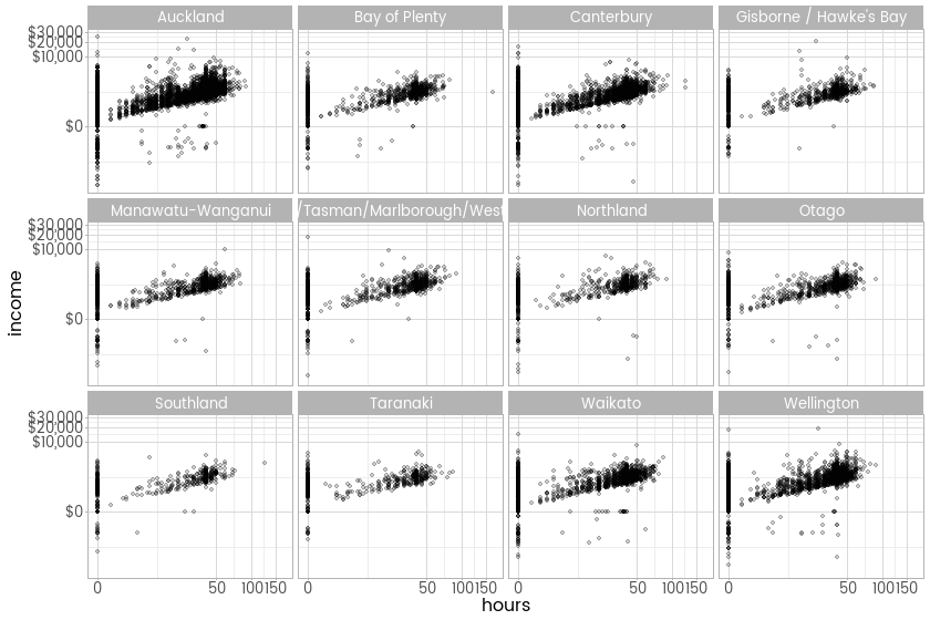
ggplot(inc, aes(x = hours, y = income)) +
   facet_wrap(~region) +
   geom_point(alpha = 0.2) +
   scale_x_continuous(trans = modulus_trans(0.25)) +
   scale_y_continuous(trans = modulus_trans(0.25), label = dollar) +
   theme_light(base_family = "myfont")
Late addition - comparison to the untransformed version
As requested in the comments, here’s the untransformed version
![]()
ggplot(inc, aes(x = hours, y = income)) +
   facet_wrap(~region) +
   geom_point(alpha = 0.2) +
   scale_y_continuous(label = dollar) +
   theme_light(base_family = "myfont")