Last week I gave a seminar for around 40 analysts from another government agency on using graphics to represent data. In doing such presentations, I usually focus on different purposes of graphics:
- exploratory
- as part of the analysis workflow (eg as diagnosis for statistical models)
- for presenting results
Exactly what the purpose is makes quite a difference to how you go about developing the graphic - and how long you spend polishing of course.
I’m heavily influenced by Tufte’s idea of “Graphical Excellence”. Here’s a Tufte-inspired taster of an alternative to a side-by-side barchart:
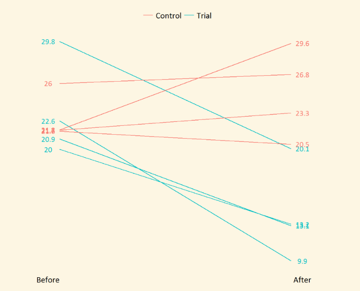
OK, it’s not perfect, and it doesn’t mean much without its context, but it gives an idea…
This particular presentation was a cut-down version of a seminar session I give at the beginning of a five week (5 x 90 minutes) internal training course on Graphics Fundamentals, with the next four sessions all hands-on implementing the principles with R, layered grammar of graphics and ggplot2.
Making slides available without the context of the talk is always dangerous. If the slides are self-sufficient, you’re not doing it right. They should be props, not scripts. Nonetheless, they might be of some interest even for those who weren’t there (a bit like Jeopardy - try to imagine what points the speaker is trying to make at different points).
This particular set of slides makes use of the reveal.js HTML presentation framework and in particular RStudio’s easy-to-use R Markdown plugin revealjs which makes it super easy to integrate R code and graphics into a nice-looking presentation. I don’t have any R code in this presentation - it was deliberately software-neutral - but I use revealjs all the time for training material and it’s fantastic to have a snippet of code so easily integrated. And the general look and feel of reveal.js is extremely pleasant.
reveal.js supports two-dimensional presentations, which means you can navigate through the slides in a slightly more sophisticated way than PowerPoint. Tip for navigating - just keep using PgDn if the arrows are confusing you!
Browse:
- the presentation slides on using graphics to represent data.
- the source code - which won’t be fully reproducible because of some data availability issues, but will give you a good idea.