Seasonality of plague deaths
In the course of my ramblings through history, I recently came across Mark R. Welford and Brian H. Bossak Validation of Inverse Seasonal Peak Mortality in Medieval Plagues, Including the Black Death, in Comparison to Modern Yersinia pestis-Variant Diseases. This article is part of an interesting epidemiological literature on the seasonality of medieval and early modern European plagues and the twentieth century outbreaks of plague caused by the Yersinia pestis bacterium. Y. pestis is widely credited (if that’s the word) for the 6th century Plague of Justinian, the mid 14th century Black Death, and the Third Pandemic from the mid nineteenth to mid twentieth centuries. The Black Death killed between 75 and 200 million people in Eurasis in only a few years; the Third Pandemic killed at least 12 million. These are important diseases to understand!
In their 2009 article, Welford and Bossak added additional evidence and rigour to the argument that the difference in seasonality of peak deaths between the first two suspected bubonic plague pandemics and the Third Pandemic indicates a material difference in the diseases, whether it be a variation in Y. pestis itself, its mode and timing of transmission, or even the presence of an unknown human-to-human virus. This latter explanation would account for the extraordinary speed of spread of the Medieval Black Death, which I understand is surprising for a rodent-borne bacterial disease. These are deep waters; as a newcomer to the topic there’s too much risk of me getting it wrong if I try to paraphrase, so I’ll leave it there and encourage you to read specialists in the area.
Plot polishing
One of Welford and Bossak’s graphics caught my eye. Their original is reproduced at the bottom of this post. It makes the point of the differing seasonalities in the different outbreaks of plague but is pretty cluttered. I set myself the job of improving it as a way of familiarising myself with the issues. My first go differed from there’s only in minimal respects:
- split the graphic into four facets for each plague agent / era to allow easier comparison
- direct labels of the lines rather than relying on a hard-to-parse legend
- added a grey ribbon showing a smoothed overall trend, to give a better idea of the “average” seasonality of the particuar era’s outbreak in each facet
- removed gridlines

All the R code for today’s post, from download to animation, is collected at the end of the post.
I think the grey ribbon of the smoothed average line is the best addition here. It makes it much clearer that there is an average seasonality in the European (medieval and early modern) plagues not apparent in the Indian and Chinese examples.
I wasn’t particularly happy with the logarithm transform of the vertical axis. While this is a great transformation for showing changes in terms of relative difference (eg growth rates), when we’re showing seasonality like this the natural comparison is of the distance of each point from the bottom. It is natural to interpret the space as proportionate to a number, as though there is no transformation. In effect, the transformation is hiding the extent of the seasonality.
I suspect the main reason for the use of the transform at all was to avoid the high numbers for some outbreaks hiding the variation in the smaller ones. An alternative approach is to allow the vertical axes of some of the facets to use varying scales. This is legitimate so long as any comparison of magnitudes is within each facet, and comparisons across facets are of trends and patterns, not magnitude. That is the case here. Here’s how that looks:

I think this is a significant improvement. The concentration of deaths in a few months of each outbreak is now much clearer.
There’s an obvious problem with both the charts so far, which is the clutter of text from the labels. I think they are an improvement on the legend, but they are a bit of mess. This is in fact a classic problem of how to present longitudinal data in what is often termed a “spaghetti plot” for obvious reasons. Generally, such charts only work if we don’t particularly care which line is which.
I attempted to address this problem by aggregating the samples to the country level, while keeping different lines for different combinations of country and year. I made a colour palette matched to countries so they would have the same colour over time. I also changed the scale to being the proportion of deaths in each month from the total year’s outbreak. If what we’re after is in fact the proportion of deaths in each month (ie the seasonality) rather than the magnitudes, then let’s show that on the graphic:

This is starting to look better.
Animating
While I think it was worth while aggregating the deaths in those small medieval towns and villages to get a less cluttered plot, it does lose some lovely granular detail. Did you know for instance that the medieval Welsh town of Abergwillar is completely invisible on the internet other than in discussion of the plague in 1349? One way around this problem of longitudinal data where we have a time series for many cases, themselves of some interest, is to animate through the cases. This also gave me a chance to use Thomas Pedersen’s handy tweenr R package to smooth the transitions between each case study.
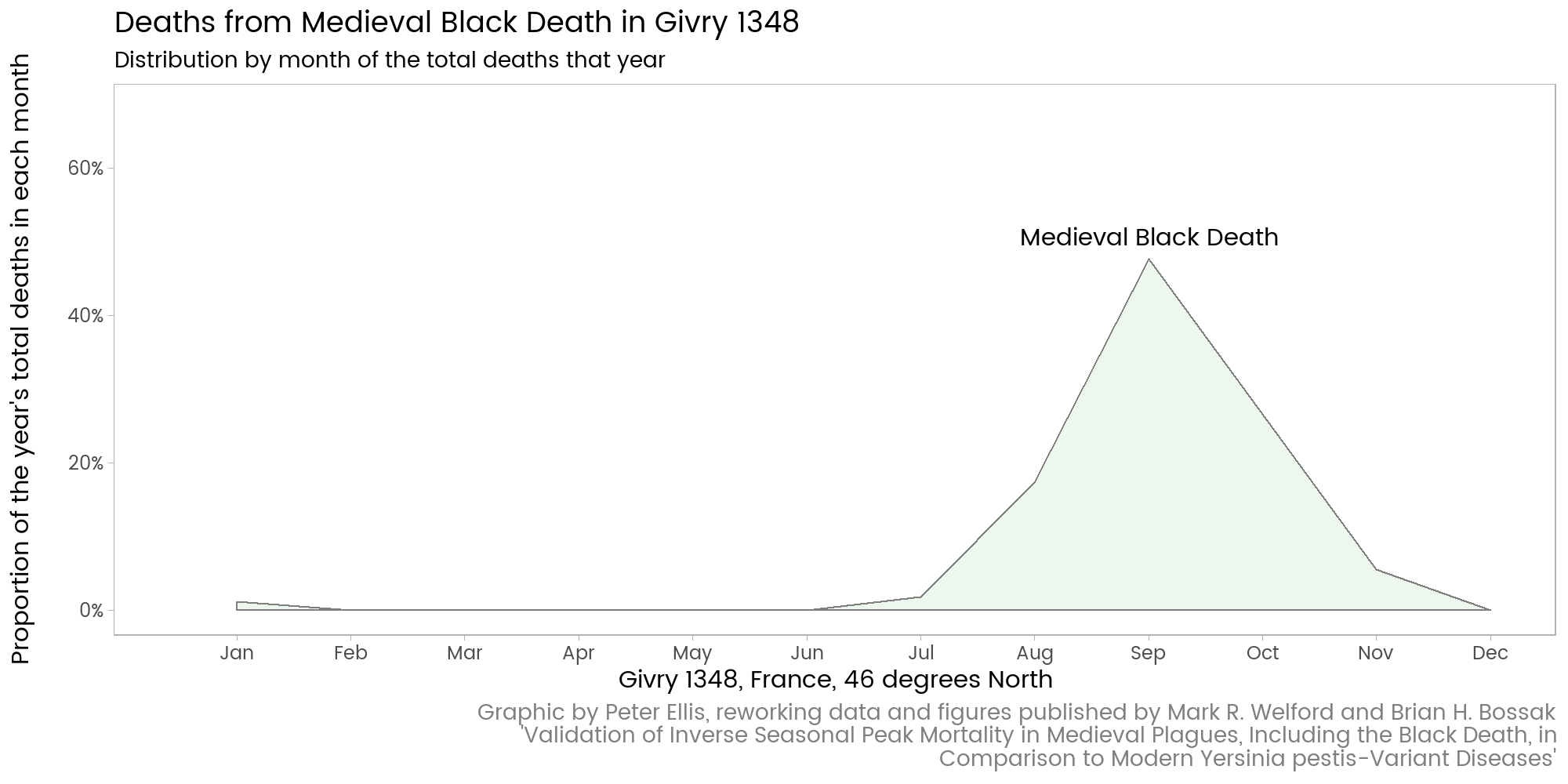
Note how I’ve re-used the country colour palette, and used the extra visual space given by spreading facets out over time (in effect) to add some additional contextual information, like the latitude of each location.
Some innocent thoughts on the actual topic
This was a toe in the water for something I’d stumbled across while reading a history book. There’s lots of interesting questions here. Plague is in the news again today. There’s a big outbreak in Madagascar, with 171 deaths between August and mid November 2017 and more than 2,000 infections. And while I have been writing this blog, the Express has reported on North Korea stockpiling plague bacteria for biological warfare.
On the actual topic of whether seasonality of deaths tells us that the medieval Black Death was different from 19th century Chinese and Indian plagues, I’d like to see more data. For example, what were the death rates by month in China in the 14th century, where the outbreak probably began? Presumably not available.
Nineteenth century Bombay was different from a medieval European village in many important respects. Bombay’s winter in fact is comparable in temperature to Europe’s summer, so the coincidence of these as peak times for plague deaths perhaps has something in common. On the other hand, Manchuria is deadly, freezing cold in its winter when pneumonic plague deaths peaked in our data.
Interesting topic.
R code
Here’s the R code that did all that. It’s nothing spectacular. I actually typed by hand the data from the original table, which was only available, as far as I can see, as an image of a table. Any interest is likely to be in the particular niceties of some of the plot polishing eg using a consistent palette for country colour when colour is actually mapped to country-year combination int he data.
Although tweenr is often used in combination with the animate R package, I prefer to do what animate does manually: save the individual frames somewhere I have set myself and call ImageMagick directly via a system() call. I find the animate package adds a layer of problems - particularly on Windows - that sometimes gives me additional headaches. Calling another application via system() works fine.
library(tidyverse)
library(scales)
library(openxlsx)
library(directlabels)
library(forcats)
library(RColorBrewer)
library(stringr)
library(tweenr)
#========download and prepare data=========
download.file("https://github.com/ellisp/ellisp.github.io/raw/master/data/plague-mortality.xlsx",
destfile = "plauge-mortality.xlsx", mode = "wb")
orig <- read.xlsx("plague-mortality.xlsx", sheet = "data")
d1 <- orig %>%
rename(place = Place, year = Date, agent = Agent, country = Country, latitude = Latitude) %>%
gather(month, death_rate, -place, -year, -agent, -country, -latitude) %>%
# put the months' levels in correct order so they work in charts etc
mutate(month = factor(month, levels = c("Jan", "Feb", "Mar", "Apr", "May", "Jun",
"Jul", "Aug", "Sep", "Oct", "Nov", "Dec")),
month_number = as.numeric(month)) %>%
mutate(place_date = paste(place, year),
agent = fct_reorder(agent, year)) %>%
arrange(place, year, month_number)
# define a caption for multiple use:
the_caption <- str_wrap("Graphic by Peter Ellis, reworking data and figures published by Mark R. Welford and Brian H. Bossak 'Validation of Inverse Seasonal Peak Mortality in Medieval Plagues, Including the Black Death, in Comparison to Modern Yersinia pestis-Variant Diseases'",
100)
#============faceted version of original graphic=====================
p1 <- d1 %>%
ggplot(aes(x = month_number, y = death_rate, colour = place_date)) +
geom_smooth(aes(group = NULL), se = TRUE, colour = NA, size = 4) +
geom_line(aes(x = month_number), size = 0.9) +
scale_y_log10("Number of deaths in a month", limits = c(1, 1000000), label = comma) +
scale_x_continuous("", breaks = 1:12, labels = levels(d1$month), limits = c(0.5, 12)) +
facet_wrap(~agent) +
theme(panel.grid = element_blank()) +
labs(caption = the_caption) +
ggtitle("Seasonal deaths by different plague agents",
"Medieval and early modern Black Death and plague peaked in summer, whereas early 20th Century outbreaks peaked in late winter")
direct.label(p1, list("top.bumpup", fontfamily = "myfont", cex = 0.8)) # good
# version with free y axes as an alternative to the log transform
p1b <- p1 +
facet_wrap(~agent, scales = "free_y") +
scale_y_continuous()
direct.label(p1b, list("top.bumpup", fontfamily = "myfont", cex = 0.8))
#==============================y axis as proportion===================
d2 <- d1 %>%
group_by(country, year, month_number, agent) %>%
summarise(deaths = sum(death_rate, na.rm = TRUE)) %>%
mutate(country_date = paste(country, year)) %>%
group_by(country_date) %>%
mutate(prop_deaths = deaths / sum(deaths, na.rm = TRUE)) %>%
# convert the zeroes back to NA to be consistent with original presentation:
mutate(prop_deaths = ifelse(prop_deaths == 0, NA, prop_deaths))
# Defining a palette. This is a little complex because although colour
# is going to be mapped to country_year, I want each country to have its own
# colour regardless of the year. I'm going to use Set1 of Cynthia Brewer's colours,
# except for the yellow which is invisible against a white background
pal1 <- data_frame(country = unique(d2$country))
pal1$colour <- brewer.pal(nrow(pal1) + 1, "Set1")[-6]
pal2 <- distinct(d2, country, country_date) %>%
left_join(pal1, by = "country")
pal3 <- pal2$colour
names(pal3) <- pal2$country_date
# draw graphic with colour mapped to country-year combination, but colours come out
# at country level:
p2 <- d2 %>%
ggplot(aes(x = month_number, y = prop_deaths, colour = country_date)) +
geom_smooth(aes(group = NULL), se = TRUE, colour = NA, size = 4) +
# geom_point() +
geom_line(aes(x = month_number)) +
scale_color_manual(values = pal3) +
scale_y_continuous("Proportion of the year's total deaths in each month\n",
label = percent, limits = c(0, 0.65)) +
scale_x_continuous("", breaks = 1:12, labels = levels(d1$month), limits = c(0.5, 12)) +
facet_wrap(~agent) +
theme(panel.grid = element_blank()) +
ggtitle("Seasonal deaths by different plague agents",
"Medieval and early modern Black Death and plague peaked in summer, whereas early 20th Century outbreaks peaked in late winter") +
labs(caption = the_caption)
direct.label(p2, list("top.bumpup", fontfamily = "myfont", cex = 0.8))
#============animation===================
d3 <- d1 %>%
group_by(place_date, country, latitude) %>%
mutate(prop_deaths = death_rate / sum(death_rate, na.rm = TRUE),
prop_deaths = ifelse(is.na(prop_deaths), 0, prop_deaths)) %>%
ungroup() %>%
mutate(place_date = fct_reorder(place_date, year),
place_date_id = as.numeric(place_date)) %>%
arrange(place_date_id, month_number)
place_dates <- levels(d3$place_date)
# change this to a list of data.frames, one for each state
d3_l <- lapply(place_dates, function(x){
d3 %>%
filter(place_date == x) %>%
select(prop_deaths, month, place_date, agent)
})
# use tweenr to create a single data frame combining those 20+ frames in the list, with interpolated
# values for smooth animation:
d3_t <- tween_states(d3_l, tweenlength = 5, statelength = 8, ease = "cubic-in-out", nframes = 600) %>%
# caution - tween_states loses the information ont the ordering of factors
mutate(month= factor(as.character(month), levels = levels(d1$month)),
place_date = factor(as.character(place_date, levels = place_dates)))
# make a temporary folder to store some thousands of PNG files as individual frames of the animation
unlink("0114-tmp", recursive = TRUE)
dir.create("0114-tmp")
for(i in 1:max(d3_t$.frame)){
png(paste0("0114-tmp/", i + 10000, ".png"), 2000, 1000, res = 200)
the_data <- filter(d3_t, .frame == i)
the_title <- paste("Deaths from", the_data[1, "agent"], "in", the_data[1, "place_date"])
tmp <- d3 %>%
filter(place_date == the_data[1, "place_date"]) %>%
select(place_date, country, latitude) %>%
distinct()
the_xlab <- with(tmp, paste0(place_date, ", ", country, ", ", latitude, " degrees North"))
the_high_point <- the_data %>%
filter(prop_deaths == max(prop_deaths) ) %>%
slice(1) %>%
mutate(prop_deaths = prop_deaths + 0.03) %>%
mutate(lab = agent)
the_colour <- pal2[pal2$country == tmp$country, ]$colour[1]
print(
ggplot(the_data, aes(x = as.numeric(month), y = prop_deaths)) +
geom_ribbon(aes(ymax = prop_deaths), ymin = 0, fill = the_colour, colour = "grey50", alpha = 0.1) +
scale_x_continuous(the_xlab, breaks = 1:12, labels = levels(d1$month), limits = c(0.5, 12)) +
ggtitle(the_title, "Distribution by month of the total deaths that year") +
theme(panel.grid = element_blank()) +
geom_text(data = the_high_point, aes(label = lab)) +
labs(caption = the_caption) +
scale_y_continuous("Proportion of the year's total deaths in each month\n",
label = percent, limits = c(0, 0.68))
)
dev.off()
# counter:
if (i / 20 == round(i / 20)){cat(i)}
}
# combine all those frames into a single animated gif
pd <- setwd("0114-tmp")
system('magick -loop 0 -delay 8 *.png "0114-plague-deaths.gif"')
setwd(pd)
# clean up
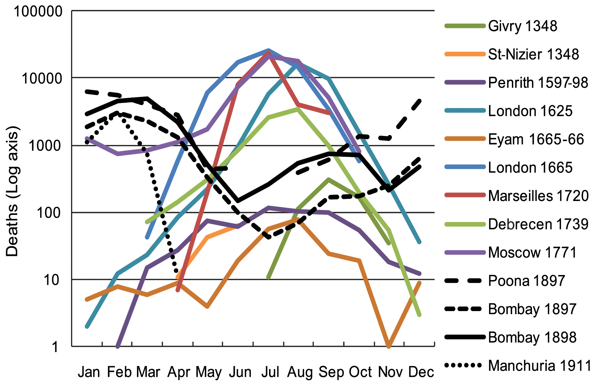
unlink("plague-mortality.xlsx")The original
As promised, here’s the original Welford and Bossak image. Sadly, they dropped Abergwillar; and they have data for Poona which I couldn’t find in a table in their paper.